How Colors and Fonts Shape Your Personal Brand Perception
How Colors and Fonts Shape Your Personal Brand Perception
5/8/20252 min read


Our personal brand perception (how others view our professionalism, credibility, and uniqueness), is deeply influenced by our visual identity. Colors and fonts aren’t just aesthetic choices; they’re strategic tools that communicate values, evoke emotions, and shape how our audience connects with us.
Let's talk about how intentional design choices can elevate or undermine our personal brand perception, and what we need to know to make our visuals work for -not against- our goals.
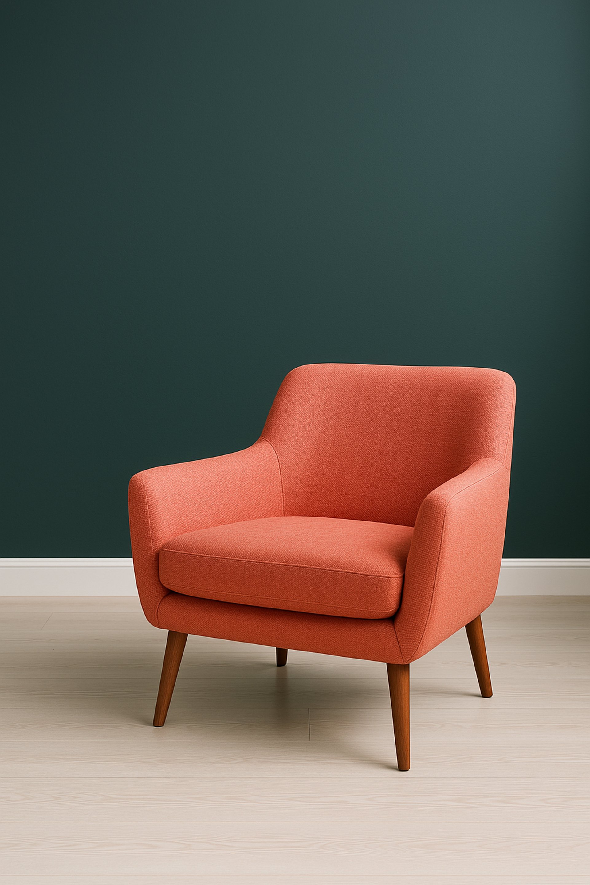
1. Color Psychology: The Silent Driver of Personal Brand Perception
Color shapes personal brand perception faster than any other visual element. Studies show it takes just 90 seconds for someone to form an opinion about a brand, and up to 90% of that judgment is based on color alone.
Blue (trust, calm) is favored by finance and tech brands like IBM and PayPal.
Green (growth, balance) dominates wellness and sustainability niches.
Purple (creativity, luxury) is used by beauty brands like Chanel.
Why this matters for your brand: If our colors clash with your industry’s norms (e.g., using playful yellow in law), we risk confusing our audience. Conversely, strategic differentiation (like Mel Robbins’ signature green and yellow palette) can make our brand instantly recognizable.
Key takeaway: Your color choices directly impact emotional resonance and audience trust-two pillars of strong personal brand perception.
2. Typography: What Our Fonts Say When We’re Not Speaking
Fonts are the unsung heroes of personal brand perception. Just as color evokes feeling, typography subconsciously signals personality:
Serif creates the perception of Traditional, trustworthy -think Tiffany & Co
Sans-serif is perceived as modern and approachable -think Apple.
Scripts feel creative and personal - think boutique brands or personal brand
The readability factor: A Harvard study notes that 72% of readers skip content with hard-to-read fonts. For example, Marques Brownlee’s tech-focused brand uses bold sans-serifs (FF Din Pro) for clarity and confidence, while luxury brands like Rolex opt for sleek serifs to convey timelessness.
Key takeaway: Typography either reinforces your credibility or creates friction in your audience’s experience.
3. Consistency: The Glue of Trustworthy Personal Brand Perception
A cohesive visual identity across platforms (website, social media, print) builds recognition and trust.
Inconsistencies like using different colors or fonts on LinkedIn vs. our website, can make our brand feel disjointed or unprofessional.
Case in point:
Tori Dunlap (Her First $100K) uses the same bold red and teal across her site, social graphics, and podcast covers.
Marianna Hewitt (Summer Fridays) maintains a minimalist palette of beige and soft gray, paired with elegant serifs, to align with her luxury aesthetic.
What to prioritize:
Color harmony: Limit the palette to 3–5 colors.
Font pairing: Use 1–2 complementary fonts (e.g., a serif for headings + sans-serif for body text).
Cross-platform audits: Ensure your visuals align on all channels.
4. Common Mistakes That Hurt Personal Brand Perception
Avoid these pitfalls that dilute our visual impact:
Overused industry clichés
Mismatched tone
Inconsistent application
5. Examples of Strategic Personal Brand Perception
Adam J. Kurtz (Artist): Primary colors + handwritten fonts reflect his playful, vulnerable style
Rachel Rodgers (Business Coach): Deep green and bold sans-serifs (Tenor Sans) signal confidence and modernity.
Mel Robbins: Bright yellow paired with black/white creates high-energy visuals that match her motivational messaging.
Final Thoughts: Our Visuals Are Our Silent Ambassador
Our personal brand perception hinges on the subtle signals our colors and fonts send. While DIY tools like Canva offer templates, strategic visual branding requires expertise to avoid costly missteps -like alienating our audience with conflicting tones or blending into a crowded market.
Ready to transform how the world sees you? Whether you’re rebranding or starting fresh, let’s ensure you build a brand that stands out. Let's connect!
Free 30min lunch break Workshop - May 15th
Unapologetic Brand: 30-Minute Blueprint for Unapologetic Differentiation
REGISTER HERE (Eventbrite)
Get In touch!
Office Location
45 Carey Avenue
Butler, NJ, 07504
Get In Touch!
(201) 897-1432
hello@kellybrito.com